Core Insight – Instrument Description
How to work with your
Data Collector
How to work with your
Data Dashboard
How to work with your Data Collector
What is most distinctive about Core Insight as a research tool is its ability to collect micro-narratives of people’s lived experiences and then enable them to interpret their own experience in relation to relevant themes. The resulting combination of micro-narratives with quantitative data about these themes enables clients to unpack deeper meaning related to the issue in focus.
1. Open text
Respondents are asked to write a short description of an event related to the instructions for each project. The instructions may be open or narrow based on the project’s purpose.
We are asking leaders and employees about digital change at work. Here are a few examples of events that have been shared;
I invited senior management for a dialogue regarding digital collaboration between two departments and managed to set a date right away. I was surprised at the quick and positive response.
Micro-narrative input
Click to enlarge


I was invited into the planning phase for a new project as a representative for the end-users but many of the decisions seemed to have been made already. I saw other options that could have improved it, so I felt disillusioned about the invitation not being genuine.
I was in a project for replacing physical meetings with digital ones, partly because of geographical distance and cost issues, but later also because of Covid-19. Fortunately, the earlier work on the project made us better equipped for dealing with the sudden Covid-19 situation. We were really happy about that.
2. Title
This is followed by typing in a title or assigning #hastags for the experience.
Examples of titles for the events above;
Responsive Management
Invitation to participate was only a show for the gallery
Title
Click to enlarge
Good fortune
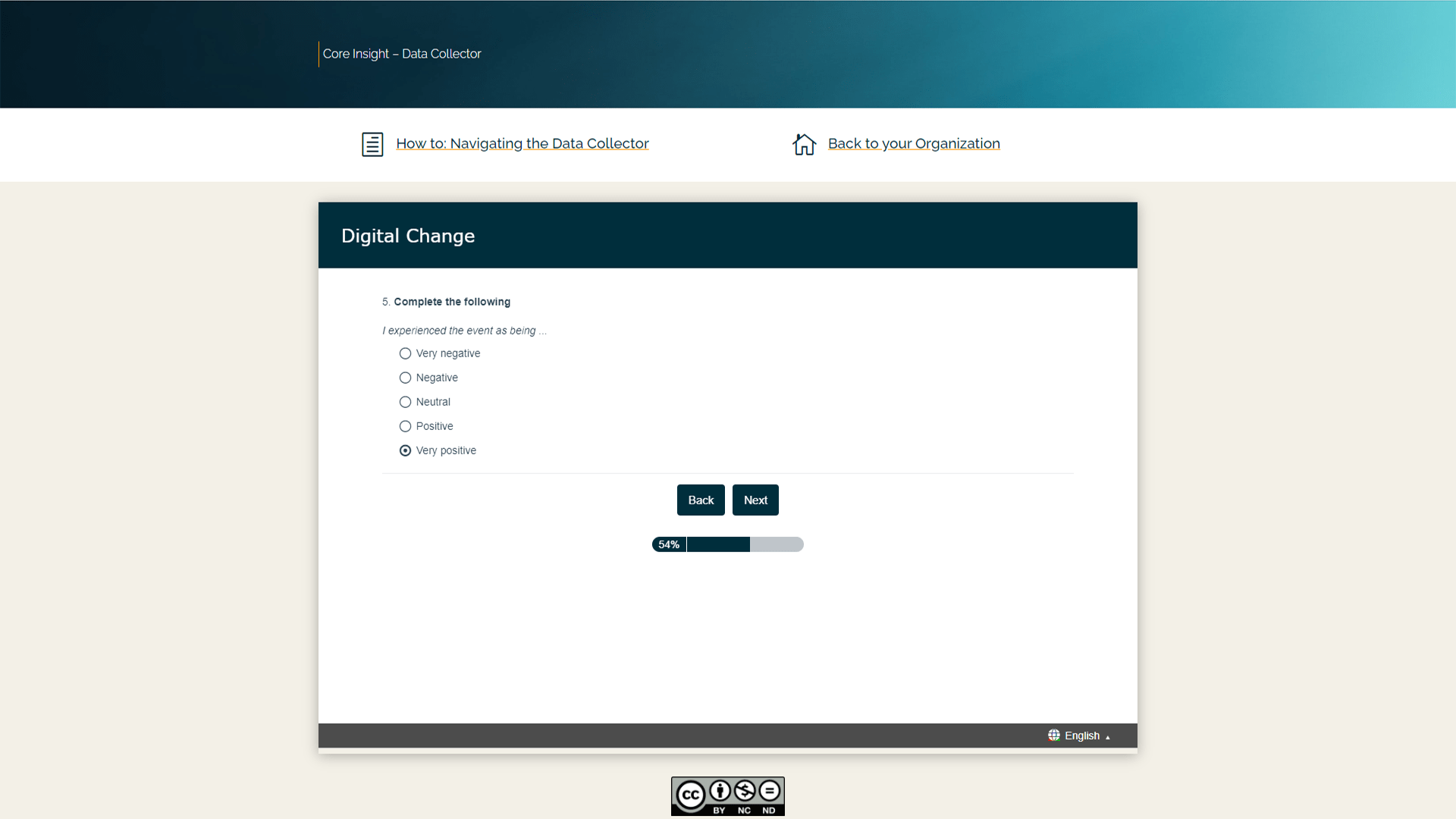
3. Multiple choice
Similar to many other types of surveys, multiple choice questions are used for gathering data used to categorize in the analyzing phase.
4. Signifiers
In the Data Collectors there are two forms of signifiers: Dyads and Triads. A signifier is used for expressing an experience with symbols.
Multiple Choice
Click to enlarge

Click on and drag the marker to where it best represents your experience.
NB: If you are using a tablet or smartphone, tap where you wish to place the marker instead of dragging it.
Check N/A box if none of the alternatives match your experience.
Dyad Signifier
Click to enlarge
Triad Signifier
Click to enlarge
How to work with your Data Dashboard
Your Data Dashboard is designed to easily visualize patterns in the data, chose filters for digging deeper and linking data points to actual experiences, all to enable you to gain insights from your data. This instruction guide will walk you through how to work most of the features in the dashboard.
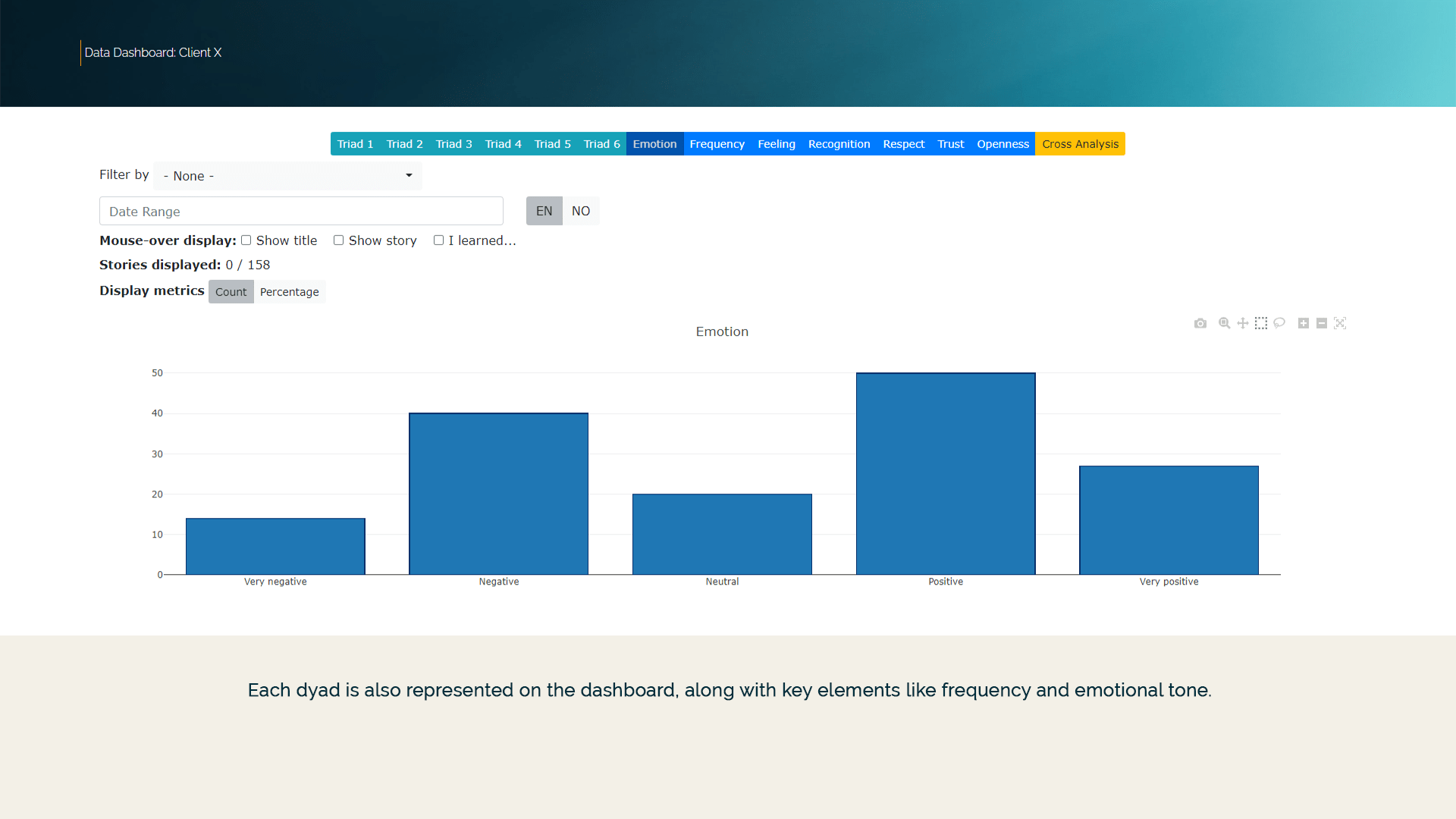
1. Main Elements
The dashboard has tabs for showing each triad, dyad or key filters from the Data Collector.
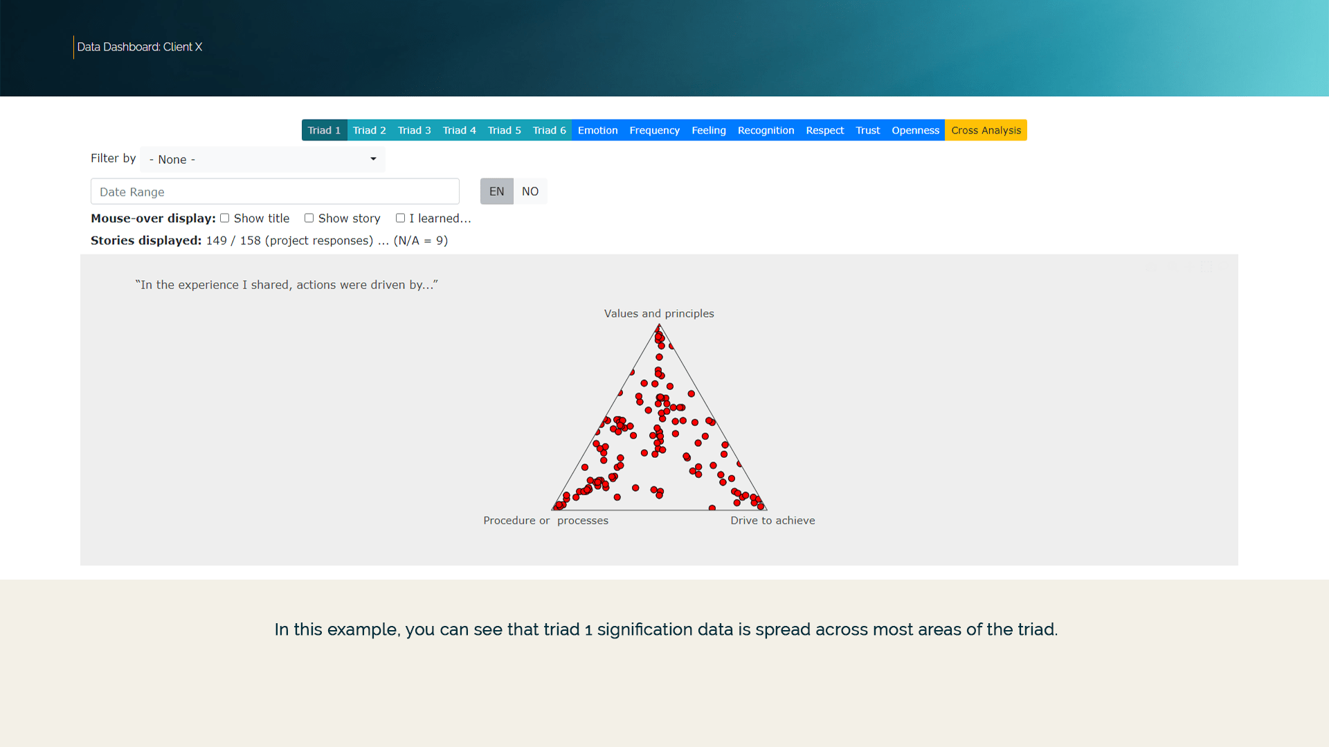
Each triad in the dashboard displays the result of the signification process for each narrative as a single red dot. This allows for easy links between signification and micro-narratives (open text).
Click on images below to enlarge illustrations of the Main Elements within the Core Insight Data Dashboard.


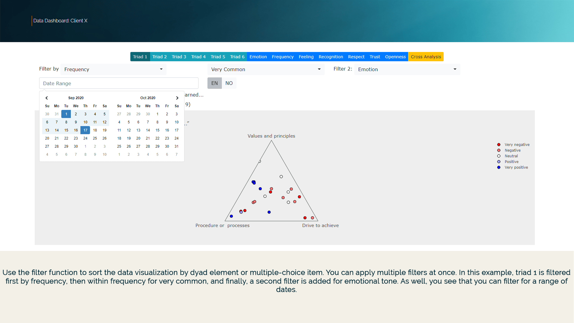
2. The Filter Function
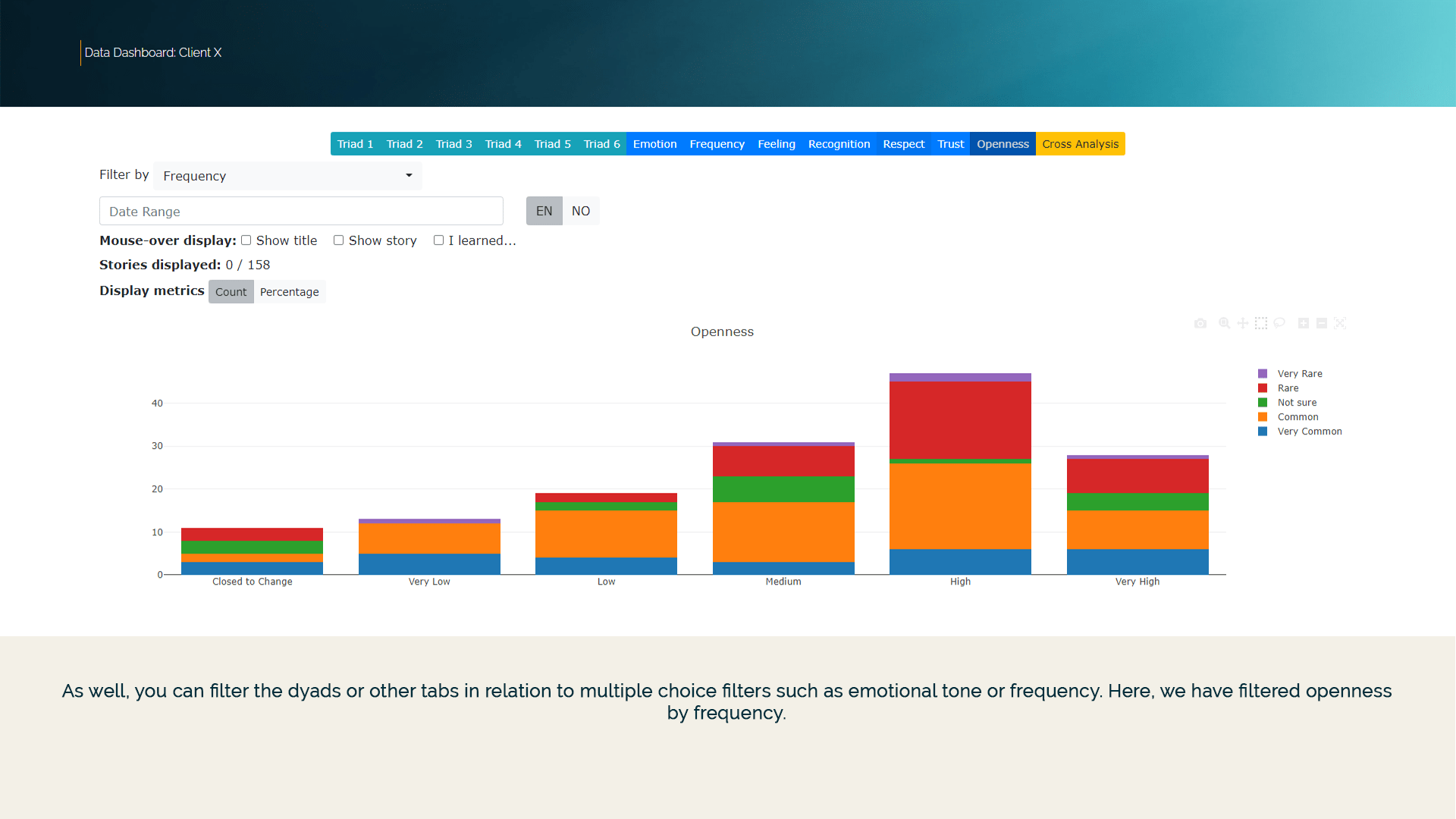
Use the filter function to sort the data visualization by triad elements, dyad element or multiple-choice item and/or submission dates.
Click on images below to see examples of the variety of filter functions within the Data Dashboard.


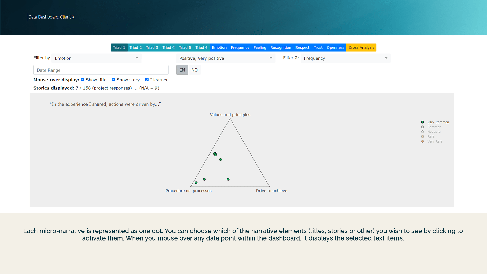
3. Micro-Narratives and Open Text
Each micro-narrative is represented as one dot. You can choose which of the narrative elements (titles, stories or other) you wish to see by clicking to activate them or choosing areas within each triad. When you mouse over any data point, it displays the selected text items. By selecting areas, text items appear in a list below the dashboard.
Click on the images below to see how text items are displayed in the Data Dashboard.


4. Other
In order to see the extra navigation tools in the upper right, you need to move your mouse over that area. Then you find the above described box and lasso tools as well as:
Zoom: Use this function in the same way as the area selectors (rectangle & lasso) to zoom in on a specific area of data.
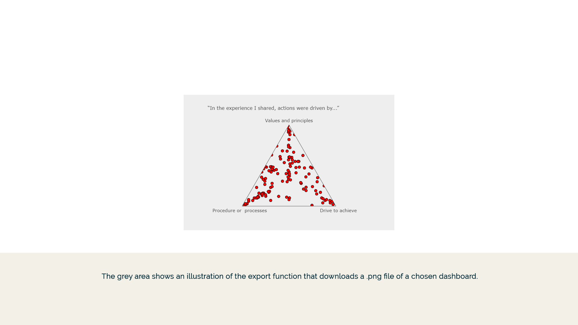
Export: Download a screenshot from the dashboard with a single click. (Camera icon).
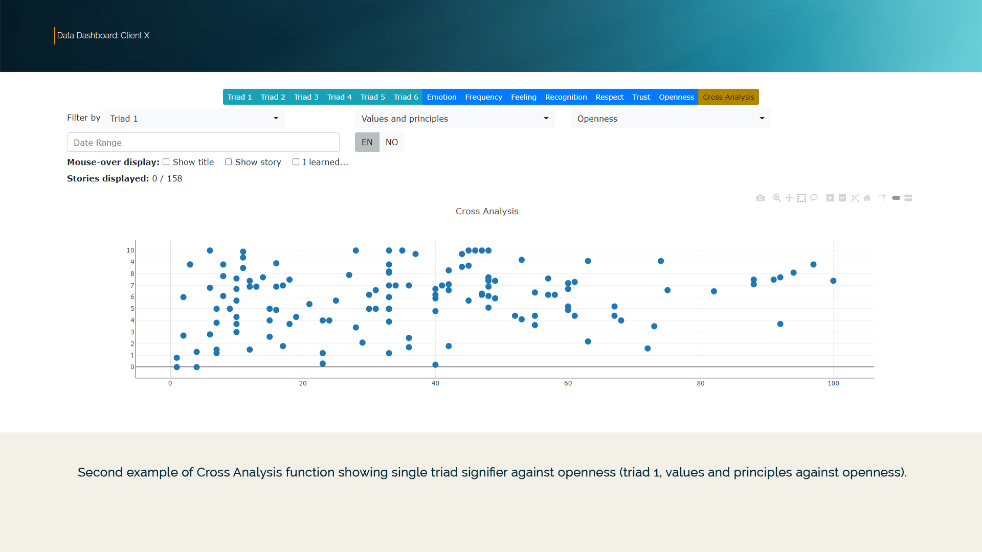
Finally, There is also a function for cross analysis. You can use this to produce x y plots (scatterplots) of specific data, such as a single triad signifier against emotional tone.

Try it out and see for yourself!
Demonstration Data Collector
Join us in exploring how digital change is being experienced at work
Data Dashboard
Request access to the dashboard to see how we can enable you to analyze data
We provide
Secure webportals for clients, customized data collector & dashboard, expertise consulting and facilitation support
Connect with us
Use the form below and we will get back to you
Choose platform
*You will now be directed to an English version of the survey. You can switch to Norwegian in the bottom right corner of the window.